Illustrations for a Custom Arcade Cabinet
A preview of what’s to come - the background of the title banner is part of the control surface illustration.
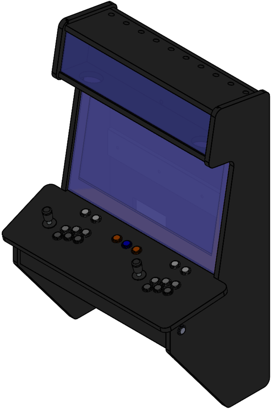
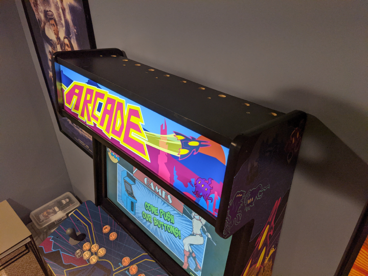
Last year a client commissioned me to create artwork for a custom arcade cabinet. It needed five surfaces covered with themed illustrations: two sides, bezel, marquee, and controls. Here I'll share a brief retrospective of the illustration work. My client built a great machine. I have his permission to share photos of the finished project and links to his CAD files in case you're thinking of making your own version of this cabinet.
First, some reflection about arcades.
Arcades mean a variety of things to me.
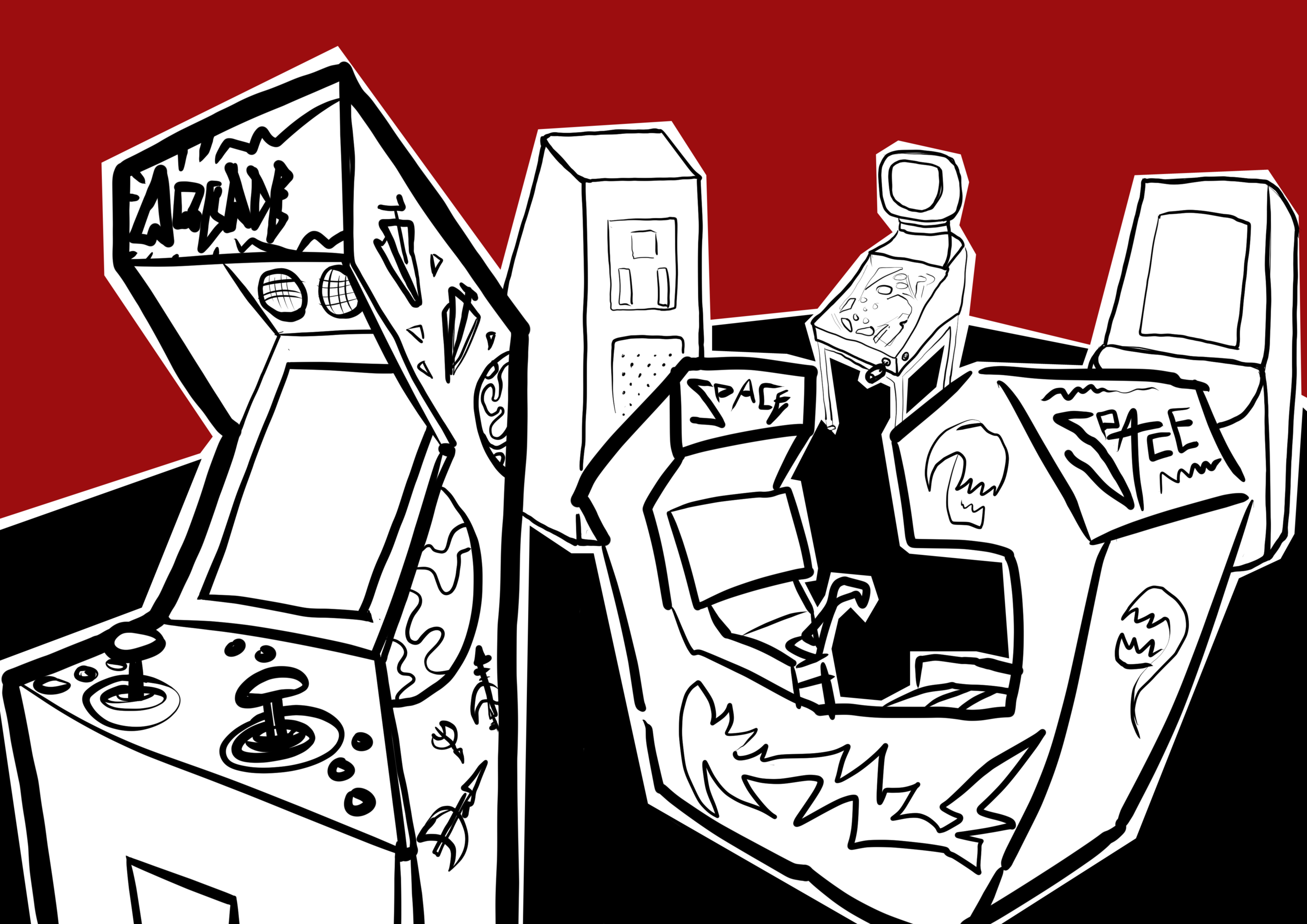
Imaginary arcade scene. I could doodle arcade scenes all day.
I was 10 years old around the time of Pac-Man and its associated fever. Instead of yearly flu that event was a cultural fad and industry boom. It meant arcade games were everywhere, tucked into corners and hallways of most stores and malls. I imagine parents were a bit annoyed since the games were unavoidable. Asking for quarters constantly was one of my hobbies.
Each game was its own invitation to imagine and play with its own physical presence with different controls. Many cabinets had huge art covering the sides. Every game opened a portal to a new world of adventure with robots, dragons, spaceships and ninjas instead of walking through home goods at K-mart.
Even in recent years, I appreciate sharing arcade outings with friends and my family. Game design has grown up a lot, the business of location based entertainment has evolved so much. Related tangent: one of these days I need to share my thoughts about visiting the amazing Two Bit Circus. Had a chance to play there a couple years ago and fell in love with that arcade like it was an 80's era Chuck E Cheese and I had a good report card from school to bring. That meant free tokens by the way. New kinds of arcades are growing alongside nostalgia arcades with classic refurbished and recreated machines almost often enough to say it's becoming a common thing.
Ok. Lots of affection for arcades.
Back to the project.
Arcade art themes = fairly certain I'd enjoy the research and iteration.
Loving the topic isn't enough of a plan to take on a project. Projects need process and constraints. Boundaries help with making good things sustainably.
Since a friend asked me to do this work and because it's something that I'm already excited about I knew it was critical to talk through the scope of the project.
If I'm the right artist for this it needs to fit with my capacity. It's easy to be eager and excited to help a friend but it's not healthy to take on free work or even paid work that's not a good fit for my time, skills, and interests.
Time to meet and decide if this is a mutual fit.
With any client and especially with a friend, good communication is critical. Be honest about your needs and situation.
Up to this point I'd never illustrated art for an arcade cabinet. Closest thing I can think of is I've designed 6 to 8 foot banners on multiple occasions to sell my game Guitar Fretter and comic Art Geek Zoo.
To plan and estimate projects that have lots of unknowns the best I can do is consider what I've done that's similar. So I thought of this as a banner illustration project with features that take time: full color, multiple subjects, and backgrounds.
We talked through the scope of the project, wants, needs, constraints. Described what the process would be like, using stages of development going from loose concepts, to stronger concepts, to completing a final concept with a round of changes. Each stage you make decisions to commit and focus further.
Time to decide. Did we both feel good about the plan, the price, and approach to getting it done? It would be super weird to end the article here given the setup but healthy too if it just wasn't a good fit.
It was a good fit for both of us. We started the loose concept phase.
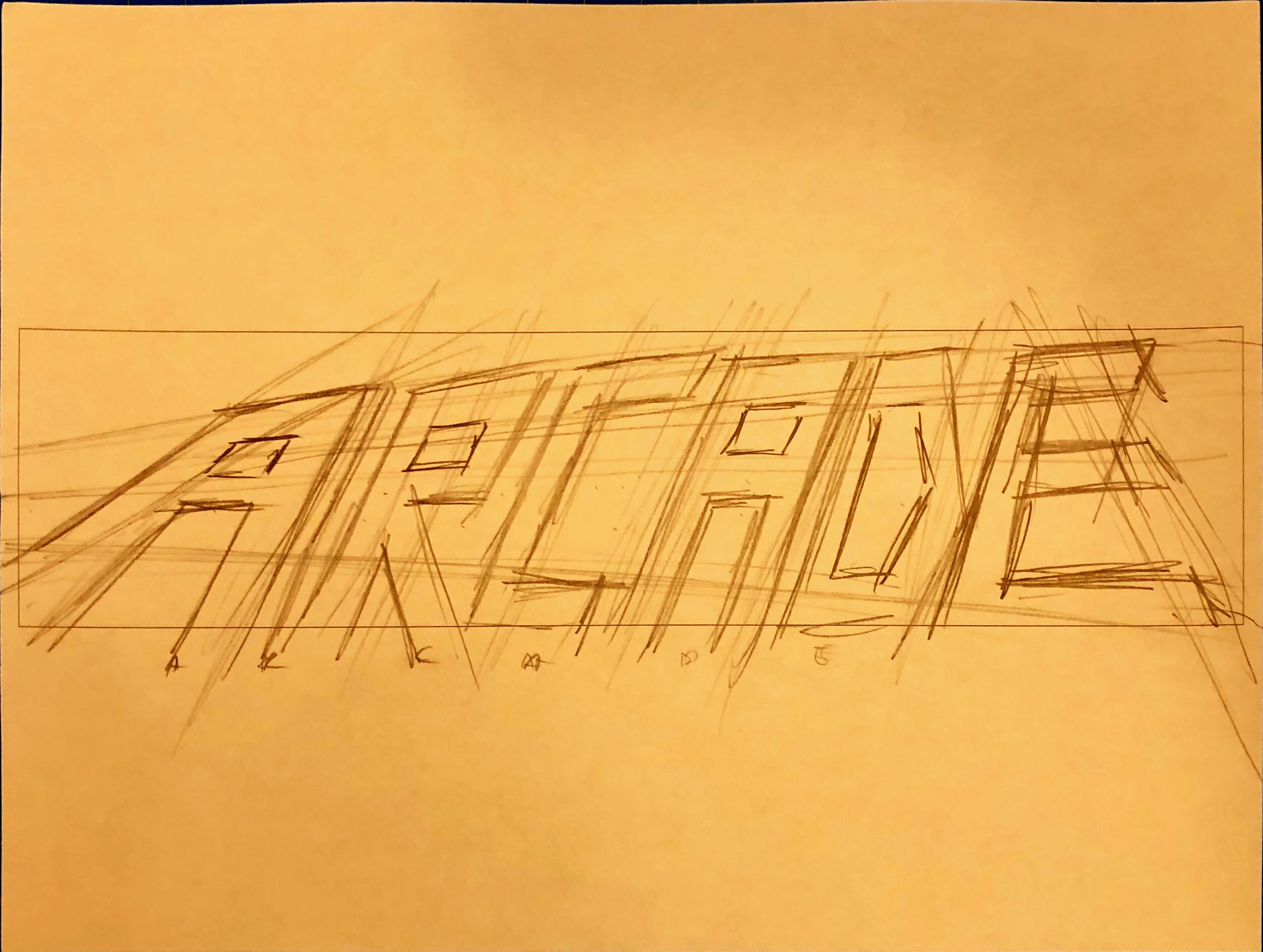
Sketch from our first project meeting.
Phase 1: Exploring loose concepts and inspiration.
I asked my client to gather inspiring reference photos of arcade games, game art, screens, titles, packaging. Also asked to describe what about each photo is calling to him and why.
Before long, he'd gathered about a hundred reference photos in an inspiration folder.
We were able to get a feel for general style. Fonts and lettering design. Color palette candidates. And most important, found the subjects and themes that he cared about most.
Phase 2: Refining the concepts and choosing a direction.
Narrowing down the large list of inspirations into compositions wasn't simple. Sketching, discussing, exploration took some time. All the ideas and nostalgia for many types of games became too much of a good thing.
To help clarify groups of choices I created scenarios. Each scenario was a visual idea plus a loose story to explain the meaning of the visual in a few sentences.
This was a side project for both me and my client. It's too easy for side projects to get stuck and become stagnant. It was now a few weeks underway and we needed to get to the next stage of development to keep things fresh and moving.
It was time to take what was working in the concepts and develop one direction.
Getting close to the final concept. First the mech will be asked to leave to make room for a tech-armored sword wielder.
Phase 3: The final direction, designing a marquee, bezel, control surface, and cabinet side art.
Four illustrations to complete. To start I focused on the side art. The side art holds the most risk due to size and amount of detail. To get a lock in on the side art would create a foundation of choices to refer to in the other illustrations: bezel, control surface, and marquee.
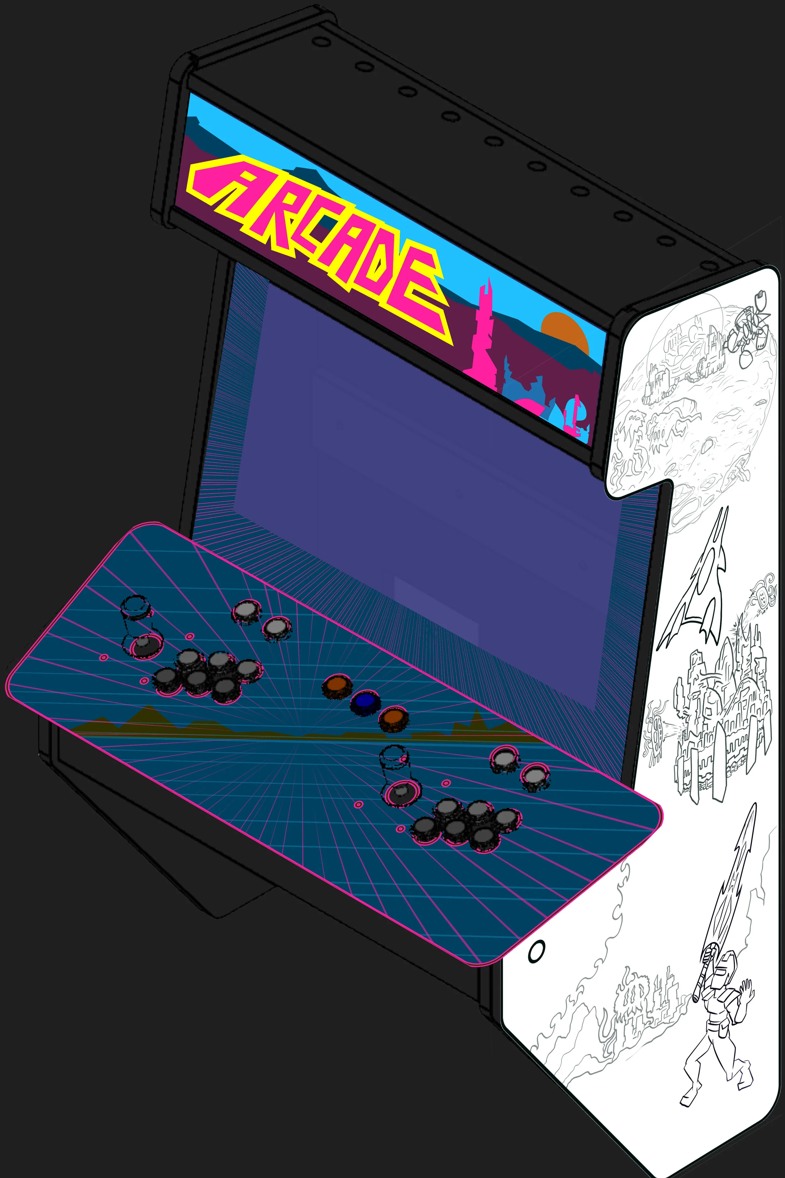
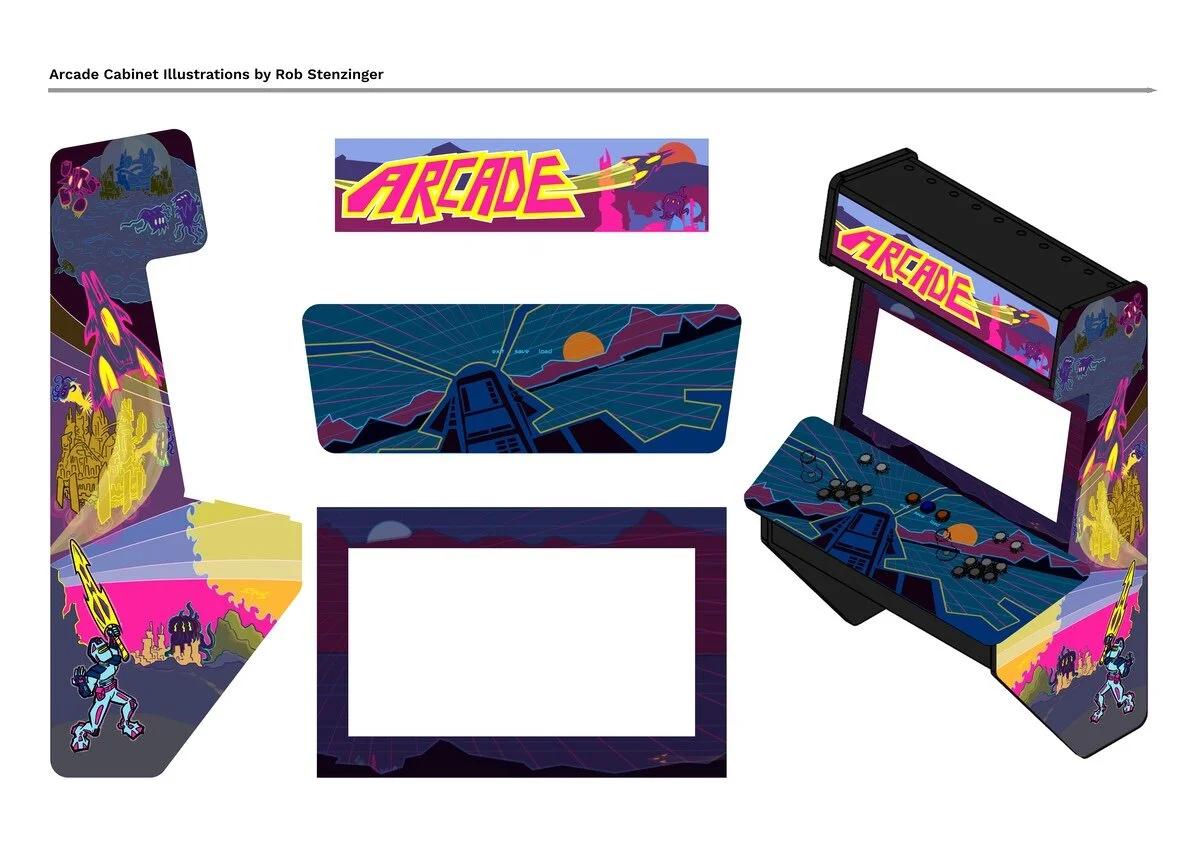
What emerged through the development: 80's feel in the color scheme of bright blues and pinks. Hand lettered marquee. References to space with monster creatures, power armor, and mighty flying aircraft to give a connected theme to all the illustrations.
The scenario that won was an iteration from a few earlier concepts and refined. The idea is this world deals with sci-fi creatures and conflicts on the ground, in the air, and even on the moon.
Artwork approved and ready to print.
The printing was handled by a shop that specializes in arcade cabinet vinyl art. The final prints used two types of vinyl stickers, one type durable to decorate the control surface, the rest use a softer vinyl.
The print step of the process had me worried. We had a small cycle of edits to be extra certain that the measurements were exact and that the files were in a format that worked for the printer.
Thanks to the good communication, precise CAD drawings, and using a printer who specializes in arcade cabinet vinyl printing, it worked.
My part of this side project complete.
Preview sheet of all illustrations and a mockup pre-vis of the cabinet.
The Cabinet Build
This thing needed to be physically built. I thought it'd happen soon after the vinyl printed art was ready. I'd ask my client for updates and learned some challenges got in the way.
My client was Patrick Greenwell who is a many skilled mechanical and electrical engineer. He brought this whole project to life. The build is not my part of the story to tell, though I did get permission from Patrick to share a little about the build here.
The biggest challenge from what I heard was the large CNC router. It had lots of trouble cutting perfectly positioned and perfectly round holes for the control surface. The CNC needed a lot of trouble shooting and upgrading.
The next challenge I believe was the scope of the project. It's such a big project with attention to details that took time to develop. Selection and testing of parts. Animated lights. Developing a test rig to prototype light animations. So many great details. Patrick, please tell the whole build story at some point, I'd love to edit this post to link to it.
I wish I could have visited in-person to see the stages of prototyping and testing first hand. This particular arcade cabinet is made of so many clever design elements. It hangs on the wall which gives it a small floor footprint yet has a full size screen and controls. It has custom programmed light animations that run along the sides, the marquee, and the control surface.
Feature highlights of Patrick's custom arcade cabinet:
- Overall planning and design of a full size wall hanging cabinet with no floor footprint.
- 3D CAD of the cabinet itself.
- Bill of Materials with high quality arcade buttons and sticks.
- Cabinet custom controllable LED molding lighting.
- Custom code to control the lighting with cohesive animation that includes the lights in the molding, marquee, and the buttons on the control surface.
- Custom settings for saving and loading games.
- Custom PCB's for the game controls and light controls.
- Built it all with amazing attention to detail and wire management.
And Patrick published the source for the CAD and PCB designs as a GitHub project! If you have affection for arcades and love the idea of building a home arcade, his designs are full of ideas and inspiration.
Into the idea of making more arcade cabinet art.
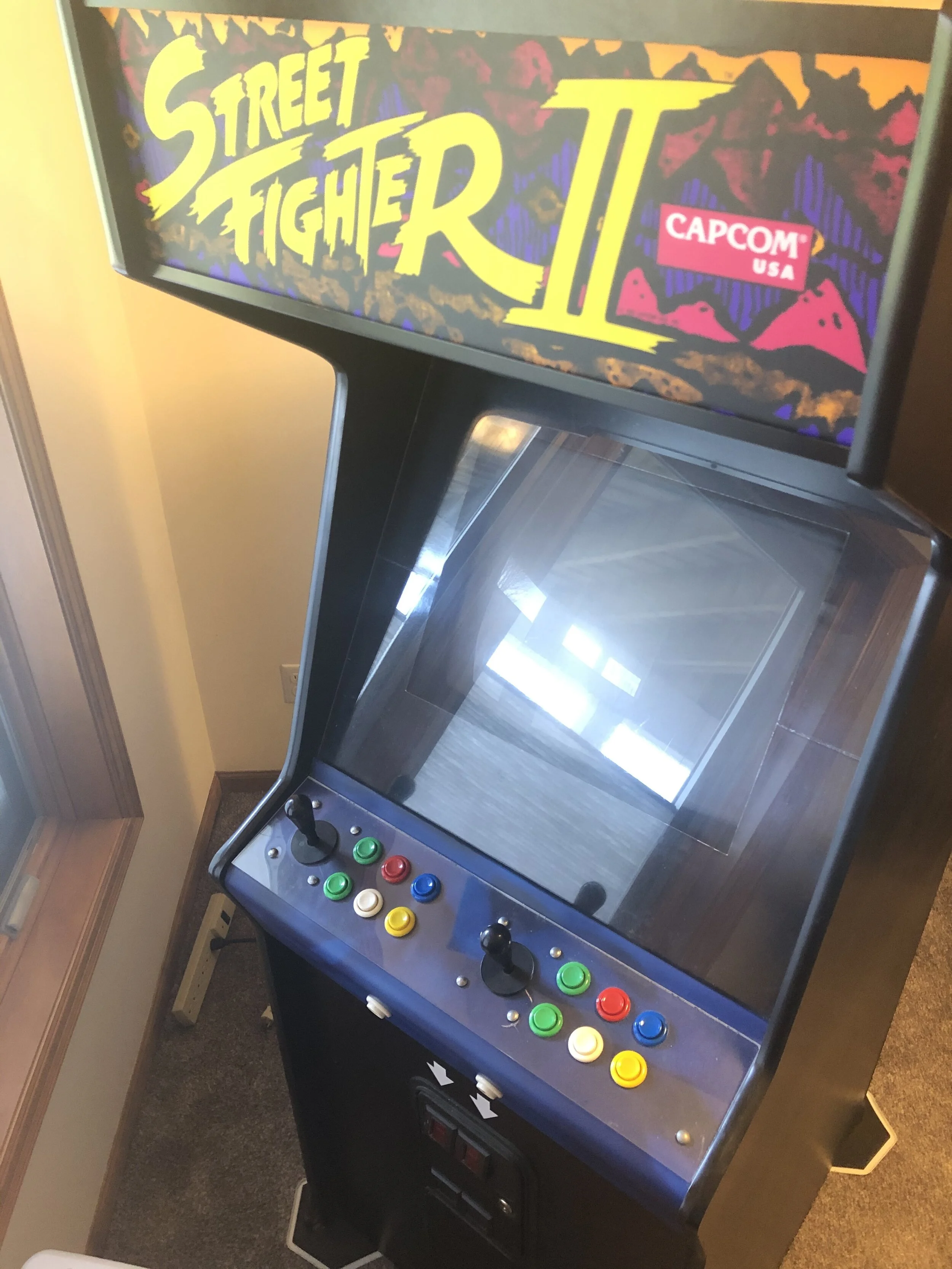
Someday soon I’ll get to this refurbish and custom project, my Street Fighter II cabinet.
Working on this project gave me all kinds of inspiration to refurbish my Street Fighter II cabinet. We'll see if I have some time for that later this year, thinking maybe September.
If you've thought of illustrating or commissioning your own arcade cabinet art, I hope this project gives you some inspiration to go for it. Imagine a hypothetical game and make the machine an art installation to celebrate how you see arcade games.


