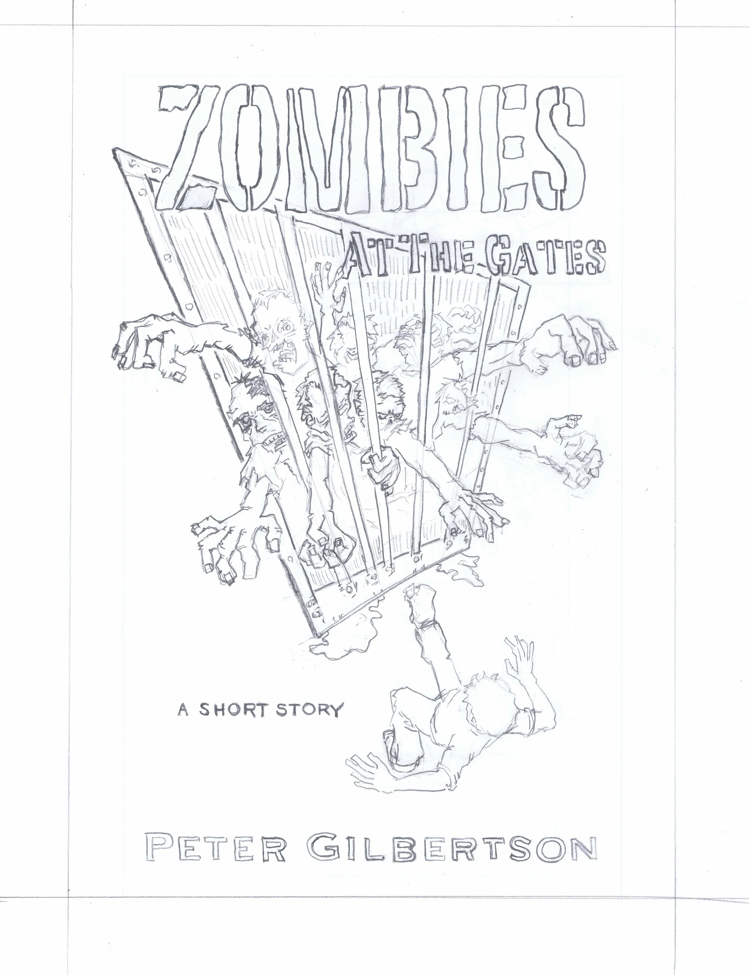
Book Cover for Zombies at the Gates, From Sketch to Finish
I'd worked with Pete Gilbertson before, for a chapter of Art Geek Zoo: The Way of Sound. I dig his work and was excited to hear he was going to be publishing Zombies at the Gates. After reading the story and a few discussions later - I landed the commission and was off and running.
My read through of Zombies at the Gates provided me with strong visual impressions and a few composition elements came to mind. A cell door, zombie arms, and a person backing away from the barred door. Even with so few elements - a bajillion permutations and treatments came to mind. After narrowing down to two concepts, I sent Pete these quick sketches.
In addition to the composition elements, I wanted to convey a feeling - something similar to the out-of-place-ness I feel when looking at Saul Bass's poster for Alfred Hitchcock's Vertigo. I don't think I captured anything close to Saul's work, yet it felt like a good inspiration to hold on to for my process.
As work progressed, I had an ongoing conversation with Pete throughout. The composition evolved out of that.
After the line work and layout was solid, the colors evolved, first to give more clarity and flow to the composition.
Finally I revised the colors to show more of the intensity of the story. There was still something missing: grit and filth. Oddly enough I had just the thing sitting on my hard drive: free, beautiful textures created by the incredibly talented Kim Holm of Cartoonarchy.com.
I present the finished cover of Zombies at the Gates and Other Tales.


